ACME, Mich., August 7, 2014 --- Recently, the Acme Business Association adopted a new official logo for the organization. The new logo is much brighter than the previous one and the design has bold graphics with vivid yellow, blue and green. (See the logo in the upper right hand corner)
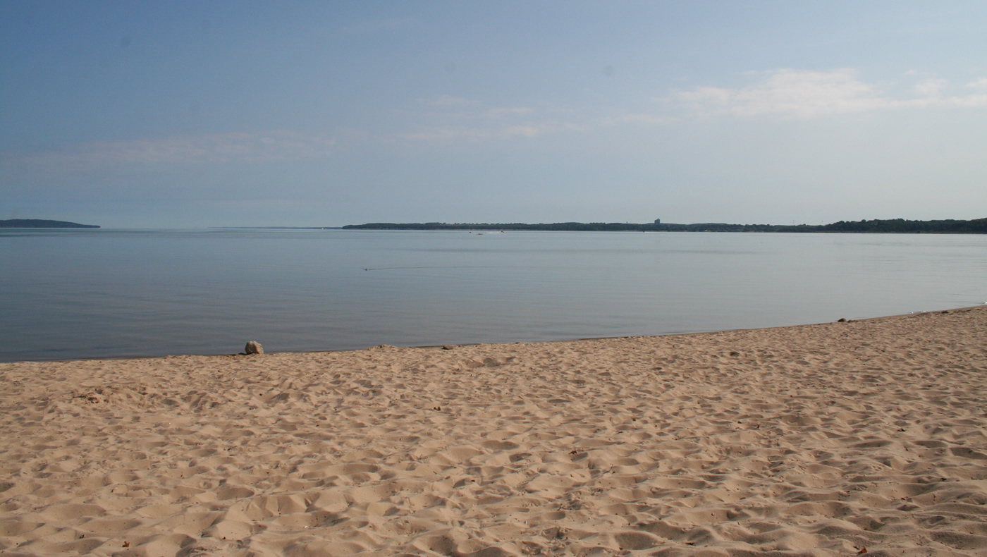
The yellow denotes the brightly shining sun. A light shade of blue represents the sky, while a darker shade is for the clear waters of East Grand Traverse Bay plus the sparkling streams and creeks that flow through Acme. Green suggests the verdant woodlands, rolling fields, and orchards that grace the township’s 25.3 square miles. The graphic curve through the middle of the logo alludes to the 10 miles of East Grand Traverse Bay shoreline along the township.
“Our membership decided it was time to update the Association’s logo to better reflect the natural attributes and vibrancy of our beautiful area,” said Rob Evina, Vice President of the Association. “We considered several designs and we’re very pleased with the final version’s look and way it connotes the vitality of Acme.”
- About the Acme Business Association -
The Acme Business Association (ABA) was formed in January 2009 with its goals and intent unwavering. The vision as an association is to promote and protect the business community along with exploring innovative ways to promote Acme and its resources to increase awareness of what Acme has to offer. ABA members are a well-organized diverse group of business men and women dedicated to the entrepreneurial spirit and preservation of businesses in Acme.
For more information about the Acme Business Association, and its upcoming Fifth Annual Acme Fall Festival on September 27, 2014, visit www.discoveracme.com .
###


 RSS Feed